
Ready to unlock the beautiful world of hand lettering? Let's get one thing straight from the start: this isn't about having perfect handwriting. It’s about learning to draw beautiful letters—and you absolutely can.
Consider this guide your official permission slip to get creative, embrace the messy parts, and discover a new passion. Forget the myth that you need to be a "natural" at this. Anyone can learn to turn words into art. This is your journey, and it begins with a single, intentional stroke.
Your Creative Lettering Journey Starts Now
Hand lettering is one of the most welcoming and accessible art forms out there. It’s not strict calligraphy with its rigid rules. Instead, hand lettering is all about celebrating your unique style and finding joy in the process.
The secret is to see each letter as its own little illustration. This simple shift in mindset opens up a universe of creative possibilities. The act of lettering is also a powerful mindfulness tool. Research shows that engaging in creative activities like drawing can significantly lower stress hormones like cortisol, making it a calming, meditative practice.
The best part? You don't need a huge budget or years of training. A simple starter kit with just the essentials can cost as little as $20–$30, making this one of the most affordable creative hobbies you can pick up.
Finding Time for Your Creativity
For most of us, starting a new hobby means figuring out where it fits into a busy life. Finding the right approach to balancing your career and creativity is a journey in itself.
But lettering can actually be the solution. It’s a wonderful, screen-free way to decompress.
Action Point: Set aside just 15–20 minutes a day. This small, consistent commitment is perfect for building muscle memory and boosting your confidence without ever feeling like a chore.
The goal isn’t instant perfection. It's about mindful progress. Every single stroke you make, even the wobbly ones, is a step forward in finding your artistic voice and experiencing the simple joy of creating something with your own hands.
What You Actually Need to Get Started
It’s easy to get overwhelmed by all the fancy pens and supplies you see online, but trust me, you don’t need any of that when you're just starting out. The focus should be on mastering the basics with just a handful of key tools.
To keep things simple and budget-friendly, here’s a breakdown of the only supplies you really need to begin your lettering adventure.
Your Budget-Friendly Beginner Lettering Toolkit
| Tool Category | What to Look For | Budget-Friendly Pick |
|---|---|---|
| Pencils & Erasers | A standard graphite pencil (like an HB) and a good polymer eraser that won't smudge your work. | Any school-grade pencil and a white vinyl eraser will do the trick. |
| Practice Paper | Look for paper that’s ultra-smooth to protect your pen tips. Avoid standard copy paper, which can be too rough. | HP Premium 32lb paper is a cult favorite for a reason—it’s affordable and incredibly smooth. |
| Beginner Pens | A small set of fine liners (like Sakura Pigma Microns) and one or two flexible brush pens (like Tombow Fudenosuke). | The Tombow Fudenosuke Hard Tip and Soft Tip Brush Pen set is the perfect starting point for learning pressure control. |
This minimalist approach ensures you learn the essential skills first, without the distraction of having too many tools. You can always expand your collection later on as you discover what you love to use.
Mastering The Fundamental Lettering Strokes
Before you can form those beautiful, flowing letters, you have to learn the alphabet of strokes they’re built from. Think of it like this: you wouldn't try to play a song on the piano without first learning the individual notes. Hand lettering is exactly the same—every elegant letter is simply a combination of a few fundamental movements.
This is where your journey truly begins. Mastering these foundational strokes will build the muscle memory your hand needs to create with confidence. This process, known as motor learning, strengthens the neural pathways between your brain and your hand, making the movements feel more automatic over time.
The infographic below shows the simple, three-step journey from gathering your tools to practicing these strokes and, finally, to creating beautiful letters.
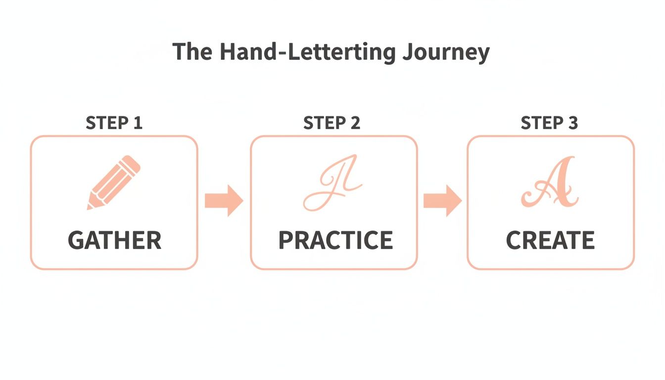
This visual highlights a key truth: practice is the essential bridge between having the right supplies and achieving your creative vision.
The Golden Rule of Lettering
The single most important concept in all of brush lettering is "thick down, thin up." This is the core principle that gives lettering its dynamic and beautiful appearance.
It's a simple idea:
- On every downstroke, when your pen moves down the page, you apply firm pressure to create a thick, bold line.
- On every upstroke, when your pen moves up the page, you apply light pressure to create a thin, delicate line.
This constant shift between heavy and light pressure creates the beautiful contrast that makes letters pop. If this feels a little awkward at first, don't worry! For many, this is a whole new way of holding a pen, and you can explore more about how to change your penmanship to find a comfortable and effective grip.
Your hand is an instrument, and these drills are how you tune it. Focus on the feeling of the pen on the paper—the gentle glide of the upstroke and the satisfying drag of the downstroke. This isn't about perfection; it's about rhythm.
Your First Drills: The Eight Basic Strokes
Let’s get your pen moving. These eight basic strokes are the building blocks you’ll use to construct every single letter in the lowercase alphabet.
Action Point: Dedicate a practice session to filling a page with each one, focusing on consistency and smooth transitions between those thick and thin lines.
- Upstroke: A thin line moving upward. Use the lightest pressure you can—let the pen tip just kiss the paper.
- Downstroke: A thick line moving downward. Apply firm, even pressure from top to bottom.
- Overturn: A thick downstroke flowing into a thin upstroke, like an upside-down 'u'.
- Underturn: A thin upstroke flowing into a thick downstroke, just like the letter 'u'.
- Compound Curve: A combination of an upstroke, an overturn, and another upstroke. This is the foundation for letters like 'n' and 'm'.
- Oval: A thick, curved downstroke on the left and a thin, curved upstroke on the right. This is one of the trickiest but most vital shapes!
- Ascending Loop: A thin upstroke that loops around into a thick downstroke. You’ll see this in letters like 'h' and 'l'.
- Descending Loop: A thick downstroke that loops around into a thin upstroke, forming the tail of letters like 'g' and 'y'.
Start by practicing these strokes slowly. The goal here isn't speed, but control and consistency. As you repeat these motions, your hand will begin to remember the pressure and movement for each one, making the whole process feel more natural and intuitive over time.
Building Your First Hand-Lettered Alphabet
Okay, you've gotten the hang of the basic strokes. Now for the really fun part—turning those simple lines and curves into a complete, beautiful alphabet. This is where you'll really start to feel like a letterer.
You'll quickly realize that every letter is just a puzzle made from the shapes you've already been practicing. A lowercase 'a' is nothing more than an oval and an underturn. An 'n' is just an overturn connected to a compound curve. See? You already know how to do this!
The goal here isn't perfection. We’re focusing on building a simple lowercase set that feels consistent and has a nice rhythm. This is where your unique style starts to peek through.
Introducing Your Guiding Lines
To keep your alphabet from looking wobbly, artists rely on guidelines. These simple horizontal lines are your absolute best friend for controlling the height, size, and slant of your letters, making them look like a cohesive family.
Think of these lines as the scaffolding for your letters. Understanding the basics of mastering professional book layout design and typography can really elevate the structure of your work.
Here are the key lines you’ll be working with:
- Baseline: The ground floor. This is the line all your letters sit on.
- X-Height: This marks the top of your main lowercase letters, like 'a', 'c', and 'x'.
- Ascender Line: This shows how high the tall parts of letters like 'h', 'l', and 'k' should go.
- Descender Line: This marks how far down the tails of letters like 'g', 'j', and 'p' should drop.
Using these four lines will instantly bring order to your practice sheets and train your eye for proper proportion.
Constructing Your First Letters
Let's start with a couple of simple letters to see how those basic strokes connect. Grab your pen and a sheet of paper with your guidelines drawn on it.
The Letter 'u':
This is a great one to start with because it’s so straightforward. It's literally just two underturn strokes, side-by-side. The main thing to focus on is making your downstrokes parallel and ensuring the tops of both strokes kiss the x-height line.
The Letter 'n':
This letter is an overturn stroke followed by a compound curve. Pay close attention to that connection point at the top. You want it to be a smooth, seamless transition, not a clunky bump.
A Quick Tip for Smooth Connections: When connecting two strokes, try lifting your pen for just a split second. This tiny pause gives you a moment to reset and approach the next stroke with intention, which helps prevent wobbly or awkward joints.
Tackling Tricky Letters and Connections
As you work through the alphabet, you'll find that some letters are more challenging. The oval—found in 'a', 'd', 'g', and 'q'—is a classic beginner's hurdle. Don't get discouraged if yours look more like lumpy potatoes at first.
Action Point: Fill a whole page with just ovals. Seriously. It’s one of the best warm-ups you can do. Remember to press down on the left side of the oval (the downstroke) and lighten up on the right side (the upstroke).
Building your first alphabet is a huge milestone. It’s tangible proof of your progress and the foundation for every word you'll create from here on out. Embrace the process, celebrate the small victories, and enjoy watching your unique script come to life.
Developing A Practice Routine That Works
In hand lettering, real progress is forged in small, consistent moments. The secret isn't about finding more time; it's about making the time you have count.
This is where the idea of purposeful practice comes in. Instead of just mindlessly filling pages, you give each session a specific goal. This simple shift can transform your practice from a chore into a powerful, skill-building habit.
The Power of Short, Focused Sessions
You don't need hours to improve. In fact, neuroscience tells us that "distributed practice"—short, regular sessions—is more effective for long-term memory retention than cramming.
Short, daily sessions of 15–20 minutes are highly effective. This method builds muscle memory quickly, keeps you engaged, and prevents burnout. Stick with it, and you could see significant progress in as little as 8–12 weeks.
Building Your Daily Practice Plan
A little structure makes all the difference. When you have a routine, you can just sit down and start.
Action Point: Try this simple 15-minute routine:
- Warm-Up (3 Minutes): Ease into it with the basics. Fill a few lines with simple upstrokes, downstrokes, and ovals. The goal here isn't perfection; it's about waking up your hand.
- Focused Drill (7 Minutes): Pick one or two specific things to work on. Maybe it's mastering a tricky letter connection (like 'br' or 'on'), getting your compound curves just right, or focusing on a consistent slant.
- Creative Play (5 Minutes): Always end with something fun! Write out a favorite short quote, your name, or a single word that makes you happy. This is crucial for keeping the joy in your practice.
The best routine is one that actually works for you. Feel free to adjust this template. Maybe you need a longer warm-up, or you want more time for creative play. Listen to what your creative spirit needs and adapt!
Creating an Inspiring Practice Space
Your environment has a huge impact on your motivation. You don’t need a fancy studio—a small, dedicated corner of a desk is perfect. The key is to keep your essential tools visible and accessible.
Action Point: Set up your "creative corner" today. Have your favorite pen, smooth paper, and maybe a guide sheet ready to go. Removing the barrier to starting makes it easier to practice. And finding the ultimate writing companion that feels perfect in your hand can make your daily routine something you truly look forward to.
Creating Your First Lettering Projects
Drills are fantastic, but the real magic begins when you start making something with your new skills. This is where all those upstrokes and downstrokes come together to create a piece you can hold, share, or frame. It’s time to take what you’ve learned and bring it to life.

Here’s a little secret: think of each letter as a small drawing, not just a part of a word. This mental shift takes all the pressure off "writing" perfectly and lets your creativity flow. The goal here isn’t a flawless masterpiece; it’s to experience the joy of making something beautiful with your own hands.
Your First Project: A Personalized Gift Tag
A simple gift tag is the perfect first canvas. It’s small, low-pressure, and adds an incredible personal touch to any present. You only need to letter a single name or a short phrase, which makes it a fantastic starting point.
Action Point: Follow these simple steps:
- Sketch it out lightly. Grab a pencil and gently map out the name or phrase. Focus on the spacing and the overall shape you want.
- Play with the layout. Should the name be centered? Slanted? Maybe you want to add a tiny flourish underneath? This is your chance to be the designer.
- Ink with intention. Once you’re happy with the sketch, take a deep breath and trace over it with your brush pen. Go slowly and remember your basic strokes.
- Erase and admire. Let the ink dry completely (seriously, wait a few minutes!), then gently erase the pencil marks. Step back and look at what you made. You just created a tiny piece of custom art!
Simple Layout And Composition Tricks
You don’t have to be a graphic designer to make your lettering look balanced and eye-catching. A few easy composition tricks can elevate your projects.
Think of your page as a stage and your letters as the actors. Your job as the director is to arrange them so they can deliver their lines beautifully. A good layout ensures every word gets the attention it deserves.
Here are a few easy-to-learn tricks to try on your next piece:
- Vary Your Styles: Try mixing a simple, clean print font (a monoline style) with your decorative script. For "Happy Birthday," letter "Happy" in a simple print and let "Birthday" flow in a beautiful script. This contrast creates instant visual appeal.
- Use Banners and Containers: Drawing a simple ribbon banner or a few leafy branches around your words can make the whole piece feel more complete and intentional.
- Embrace Asymmetry: Not everything has to be perfectly centered! Try aligning your text to the left or right for a more modern, dynamic feel.
Every project you finish, no matter how small, is a win. It builds your muscle memory, sharpens your eye, and helps you discover your own unique style. This is how you really grow as an artist—not just by drilling, but by creating.
Common Beginner Mistakes (And How to Fix Them!)
Every single artist, no matter how skilled, hits a few bumps in the road. When you're just starting out, those little roadblocks can feel huge, but they are secretly your best teachers.
Learning to spot and correct these common mistakes is exactly how you’ll build real confidence. Think of yourself as a detective. Every shaky line is a clue pointing you toward a simple adjustment. The best part? Most of these beginner issues have surprisingly easy fixes.
Why Are My Lines So Shaky?
This is the number one frustration for almost everyone starting out. You try to create a beautiful, smooth downstroke, but it comes out looking wobbly. Your first instinct is probably to blame an unsteady hand, but that's rarely the real culprit.
Shaky lines are usually caused by one of these three things:
- Your Grip: Holding the pen in a death grip creates tension that travels all the way up your arm. Action Point: Loosen up! Let the pen rest gently in your hand.
- Your Speed: It feels counterintuitive, but moving too slowly actually gives your hand more time to wobble. Try picking up the pace just a bit to create a more fluid motion.
- Your Arm Position: Are you drawing from your wrist? Action Point: Try to engage your whole arm, initiating the movement from your shoulder. This creates bigger, more stable strokes.
Don't try to fight the wobble—outsmart it. A relaxed grip and a smooth, confident stroke from your whole arm will solve this problem faster than hours of tense, slow practice ever will. It’s all about mechanics, not perfection.
Solving Pesky Ink Problems
Another classic beginner moment is when your ink won't cooperate. You might see "feathering," where the ink spreads out into the paper fibers, or "bleeding," where it soaks straight through.
Here's the secret: it's almost never the pen's fault. It’s all about the paper.
Standard copy paper has loose, absorbent fibers designed to soak up ink quickly, which is exactly what causes these issues. The fix is wonderfully simple: use ultra-smooth paper.
A ream of HP Premium 32lb paper is an affordable and fantastic choice that stops feathering in its tracks. As a bonus, it also protects the delicate felt tips of your brush pens from getting frayed. A simple paper swap is often the single biggest upgrade a beginner can make.
At Mesmos, we believe that embracing the creative process—mistakes and all—is a beautiful form of mindfulness. Explore our collection of inspiring stationery to support your artistic journey. Discover your next creative tool at Mesmos.
